
Overview
MindFit is the creation of Abbie, a startup PT who was after brand and logo design for her new business
Abbie first approached me when MindFit launched, looking for a logo and visual identity that felt approachable, professional, and supportive. As the business evolved, she returned for a brand refresh that better reflected its new direction and personality.
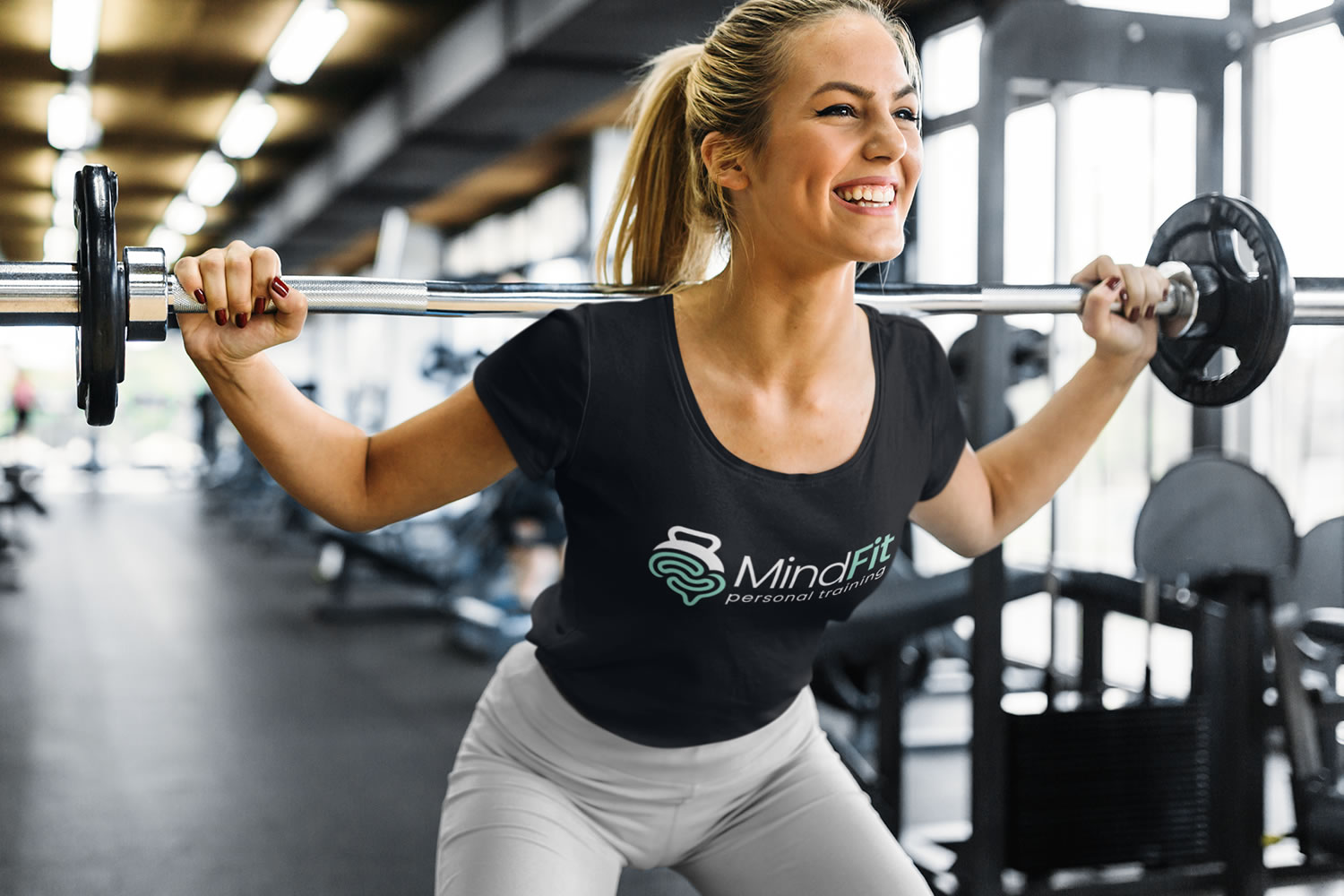
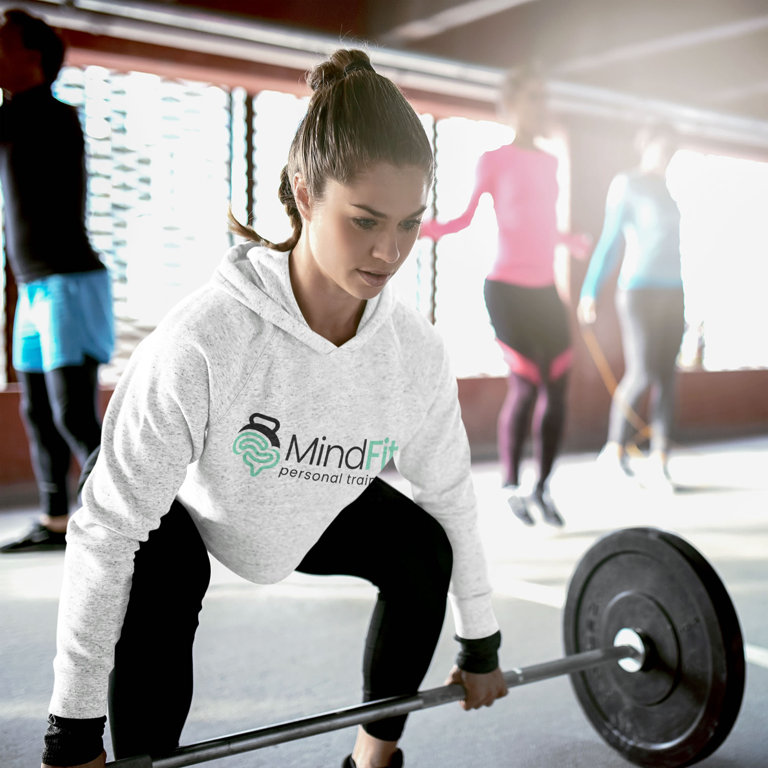
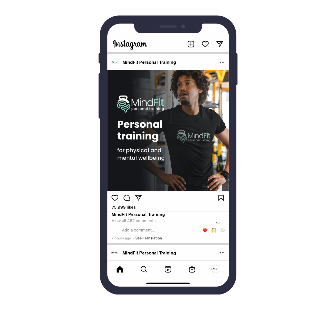
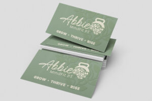
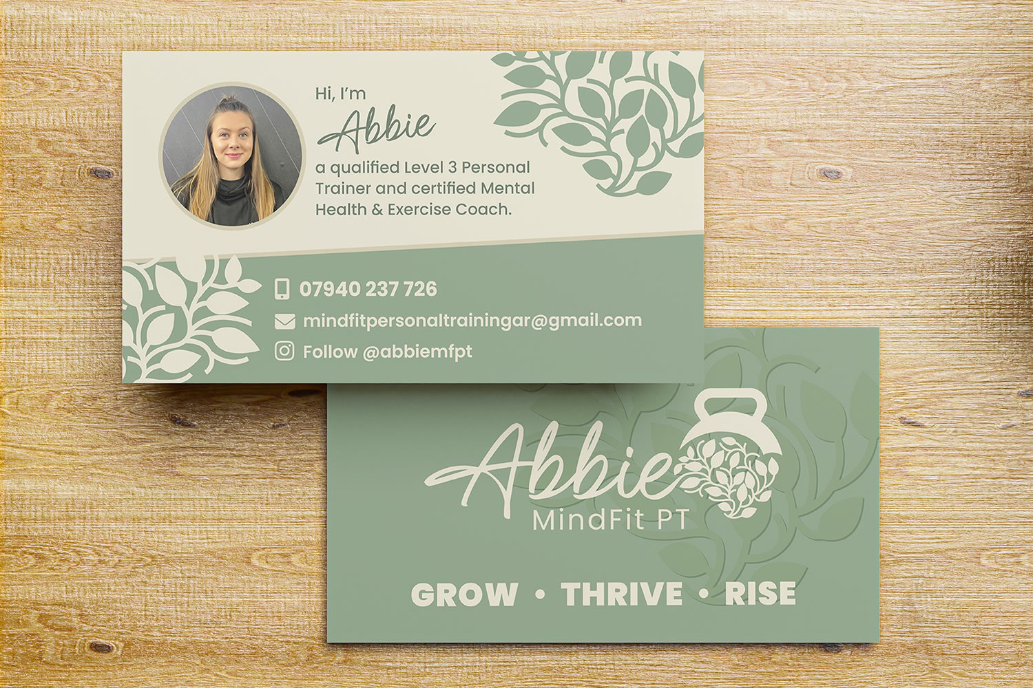
Using mood references supplied by Abbie, I developed a softer, more holistic visual style while retaining enough of the original identity to remain familiar to existing clients. The colour palette was updated to calming sage green and warm cream, while a handwritten-style font introduced a more personal feel.
The original dumbbell motif was also refined, replacing the stronger underline detail with a subtle leaf-inspired curve to shift the emphasis towards wellbeing and lifestyle fitness. The result was a more modern, confident and purposeful identity with a warmer, more nurturing feel.
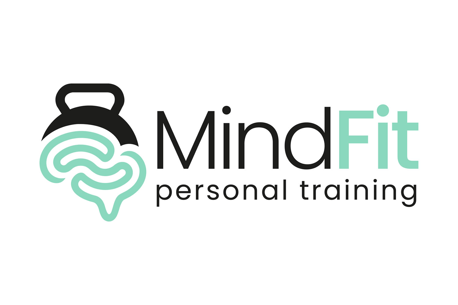
Original logo
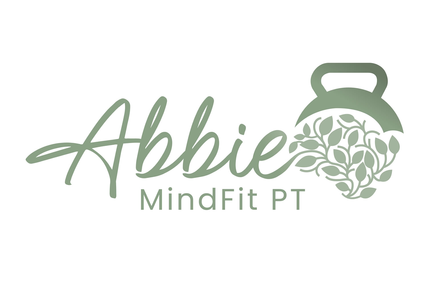
Refreshed logo
Scope of Project
Branding
Logo design
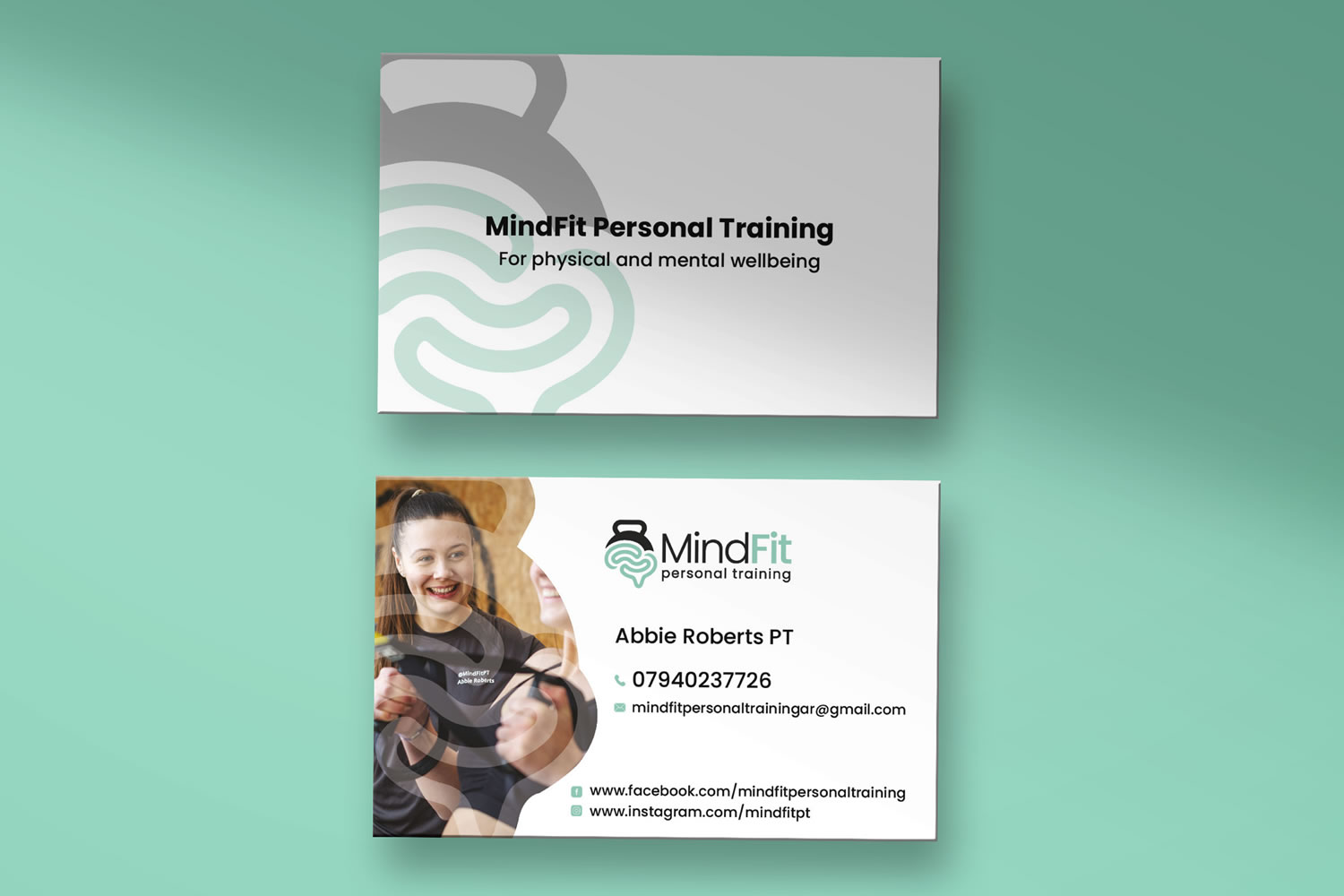
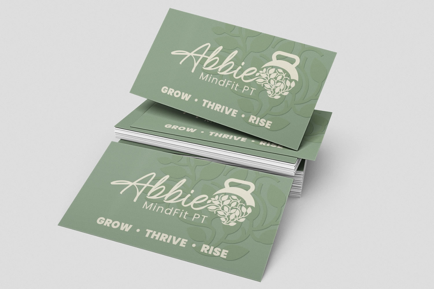
Business cards
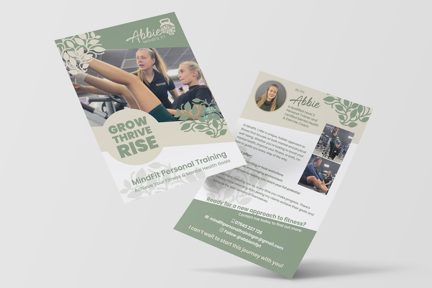
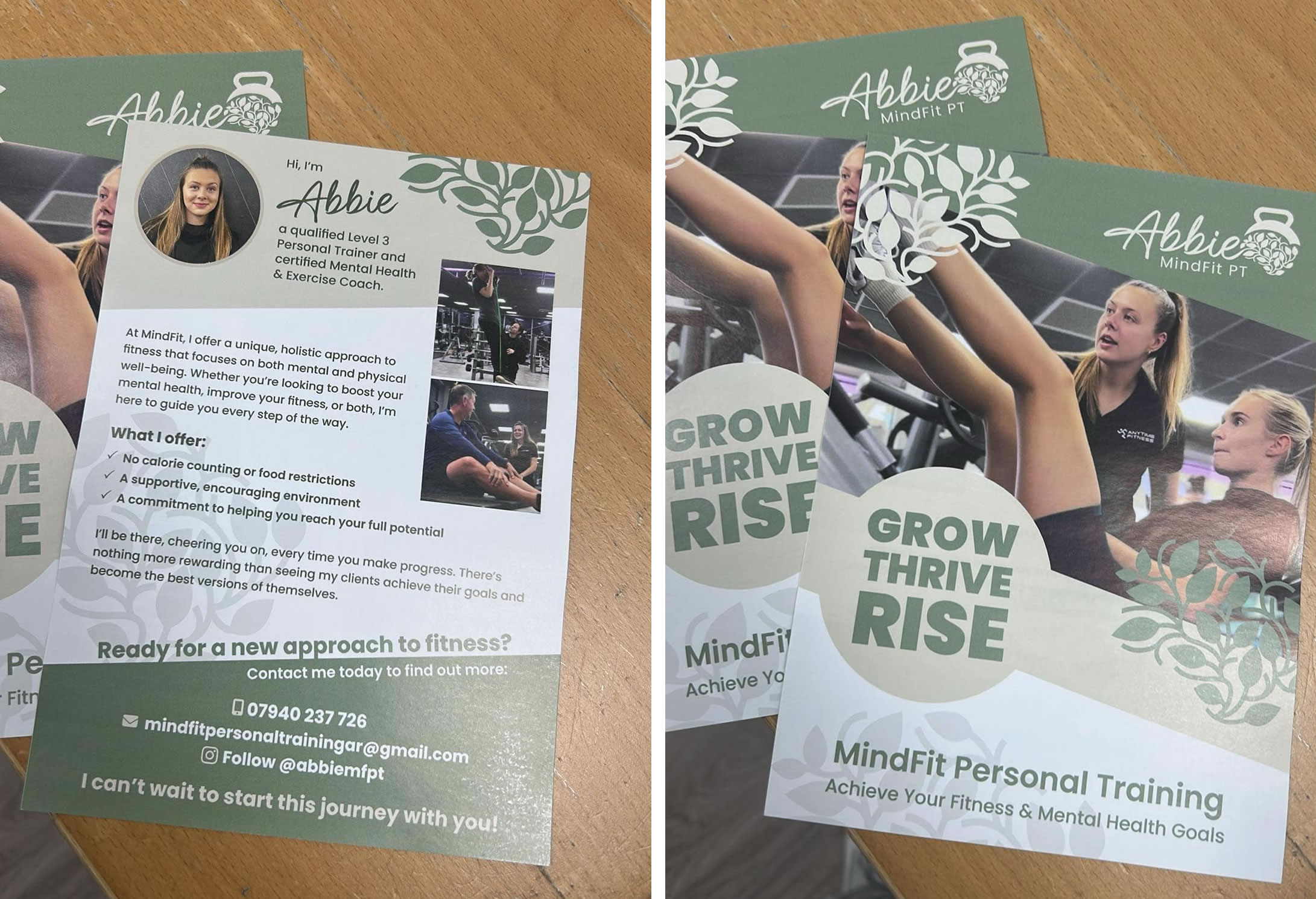
Leaflet design
Project Summary
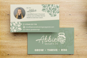
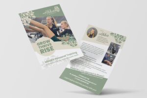
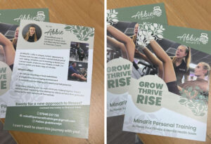
To complete the rollout of the refreshed identity, I then designed a set of supporting business cards and a promotional leaflet to help communicate the new direction consistently across both print and client-facing materials.
NEW BRAND IDENTITY
ORIGINAL BRAND DESIGN