THE CHALLENGE
EPIC Norfolk, a social enterprise delivering community sports sessions and events, approached me to create the identity for the Norwich Landmarks Half Marathon.
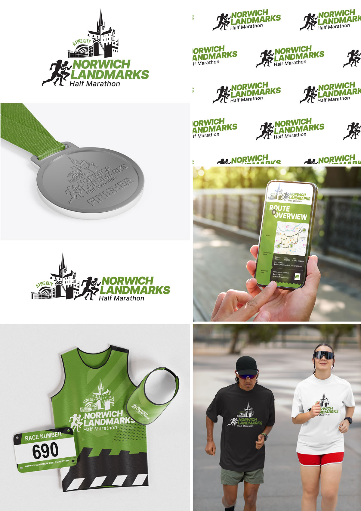
The brief was to combine three key Norwich landmarks with subtle runner silhouettes, while keeping the event name bold, clear and immediately recognisable.
THE APPROACH
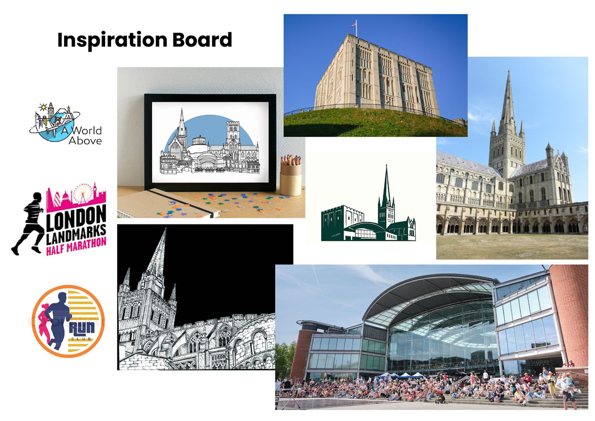
The project began with researching imagery of the three landmarks and developing a composition that brought them together in a loose triangular arrangement. Inspired by the energy of the London Landmarks Half Marathon branding, I used bold typography and angled elements to give the identity a stronger sense of movement.
Green was chosen to connect the event with both Norwich City and EPIC Norfolk’s existing branding, while black added contrast and helped the landmarks and typography remain clear across print and digital applications.
THE SOLUTION
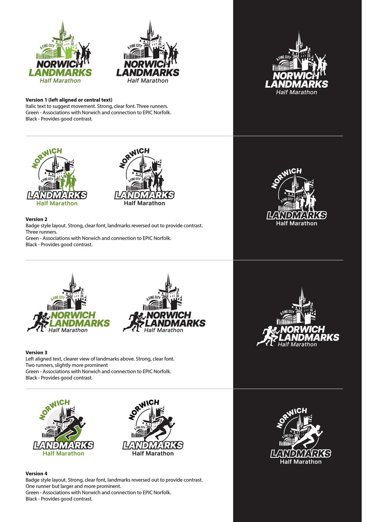
I presented four distinct logo concepts, each interpreting the brief slightly differently while retaining the key landmarks, runner silhouettes and bold typography.
Some explored a compact, badge-style format suited to merchandise and medals, while others used a wider, more dynamic composition to create a stronger sense of movement and energy.
The final direction provided a clear, flexible identity that could be applied consistently across the wider event branding.
THE OUTCOME
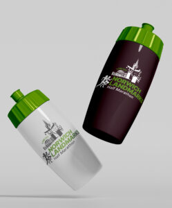
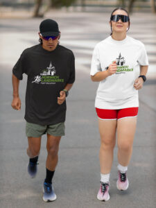
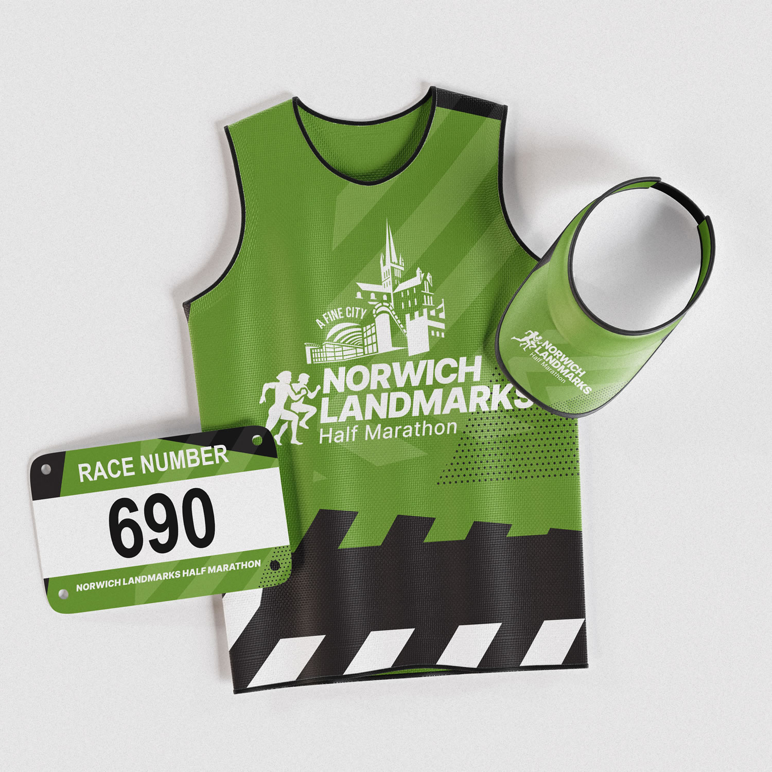
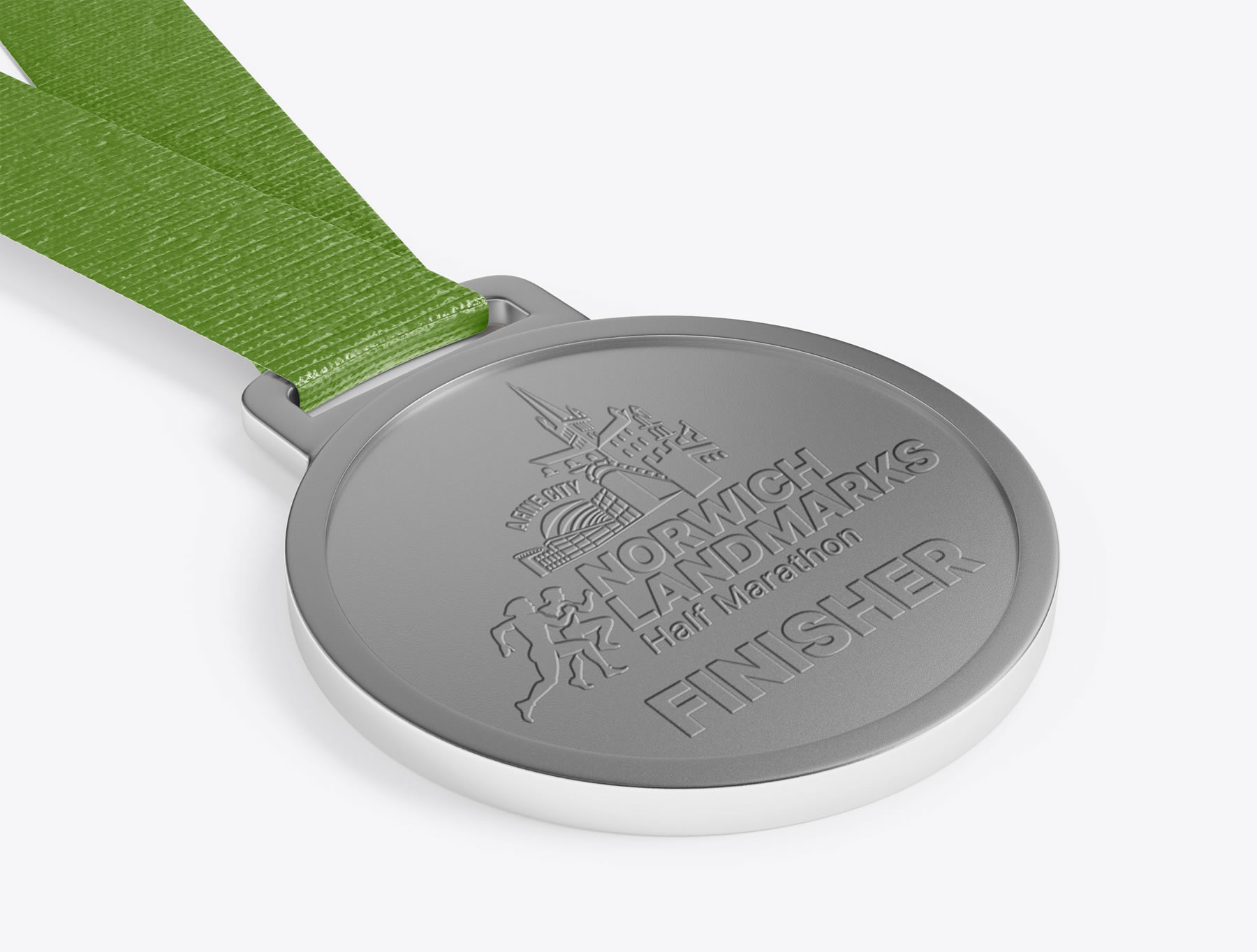
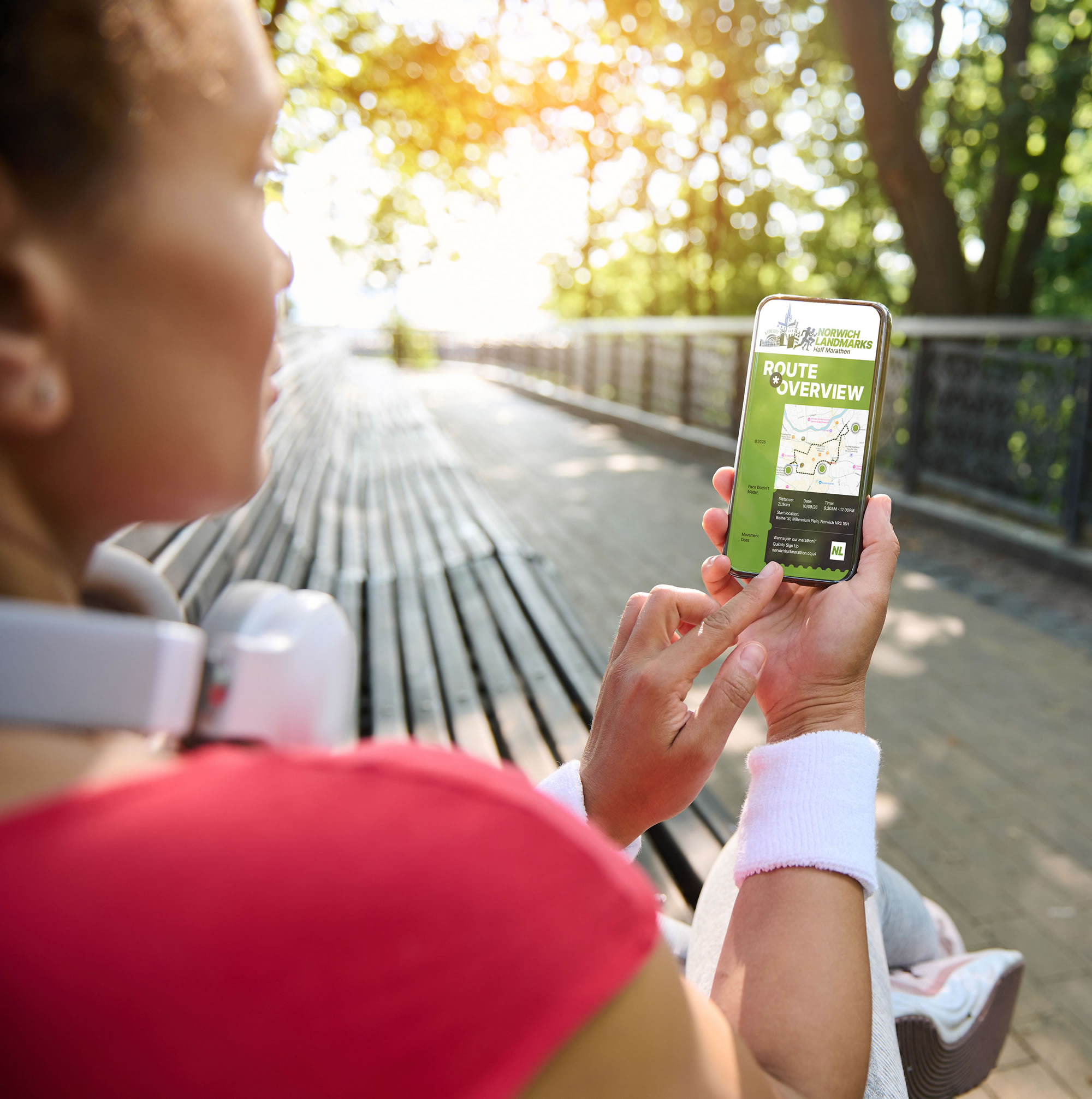
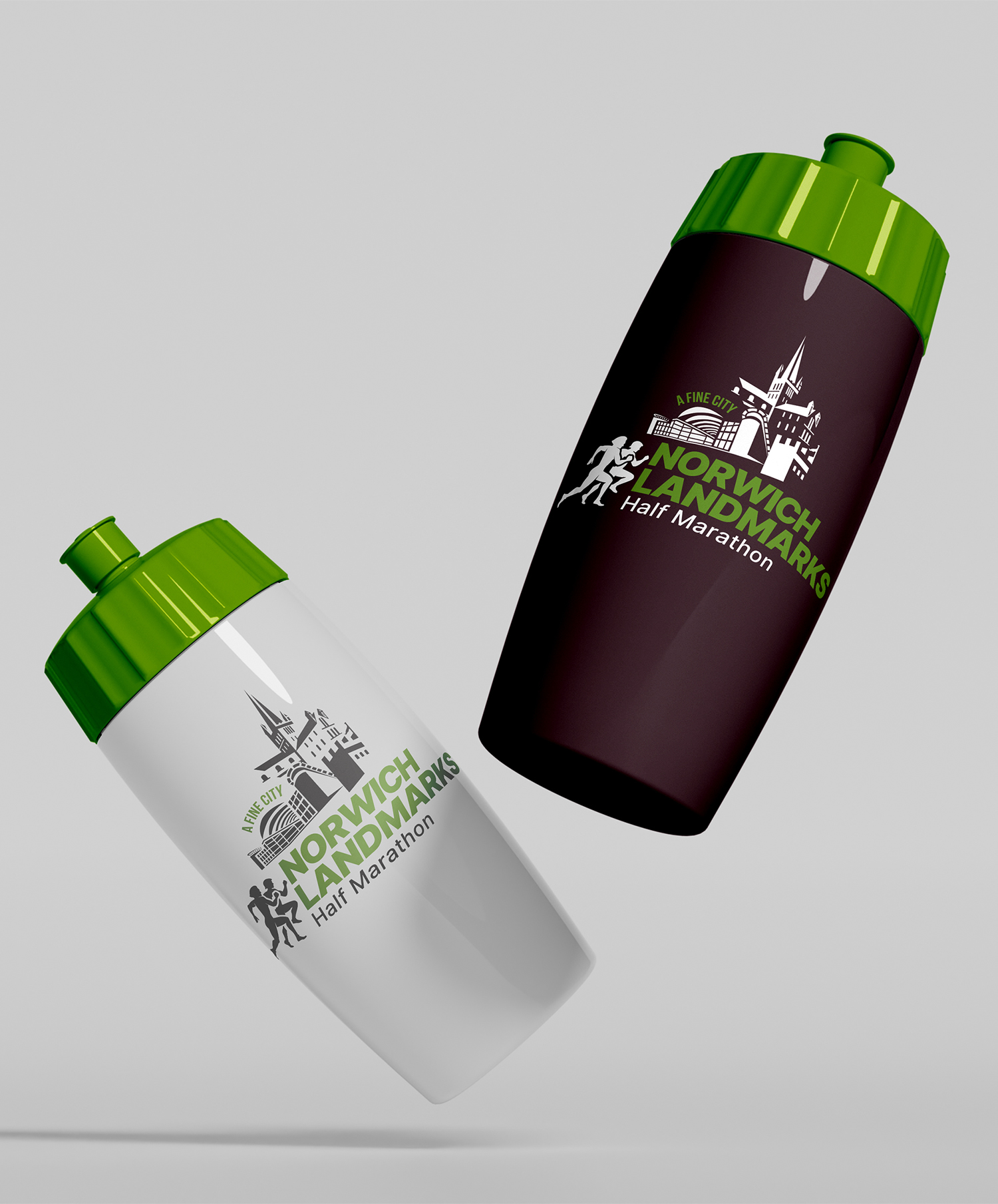
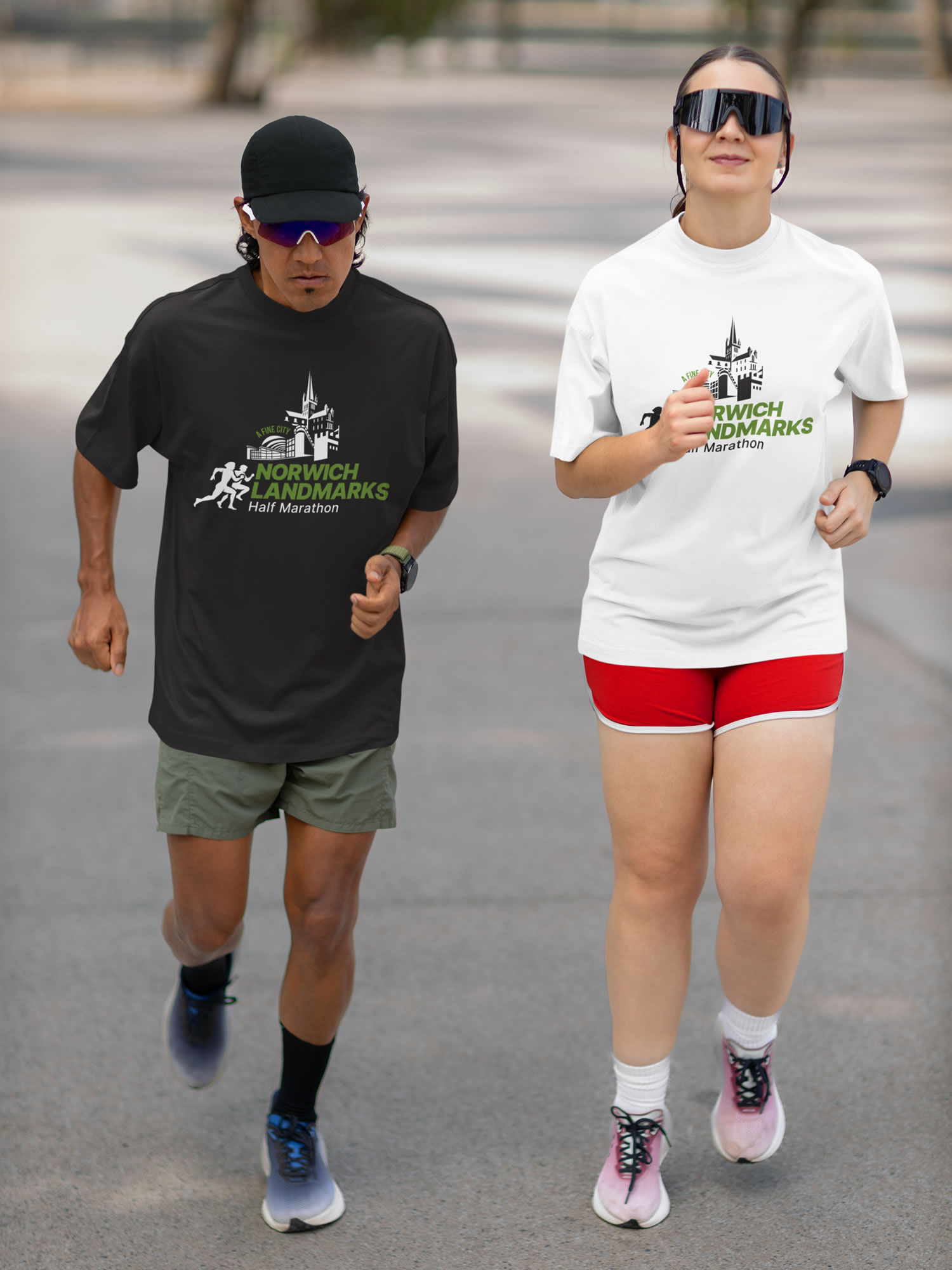
The client selected Version 3 as the final direction, which was then developed across a range of event applications including merchandise, race bibs, medals and promotional materials.
This established a flexible, recognisable identity that could be carried consistently across the wider event campaign.
Gallery
THE PROJECT EVOLVES
Logo Evolution
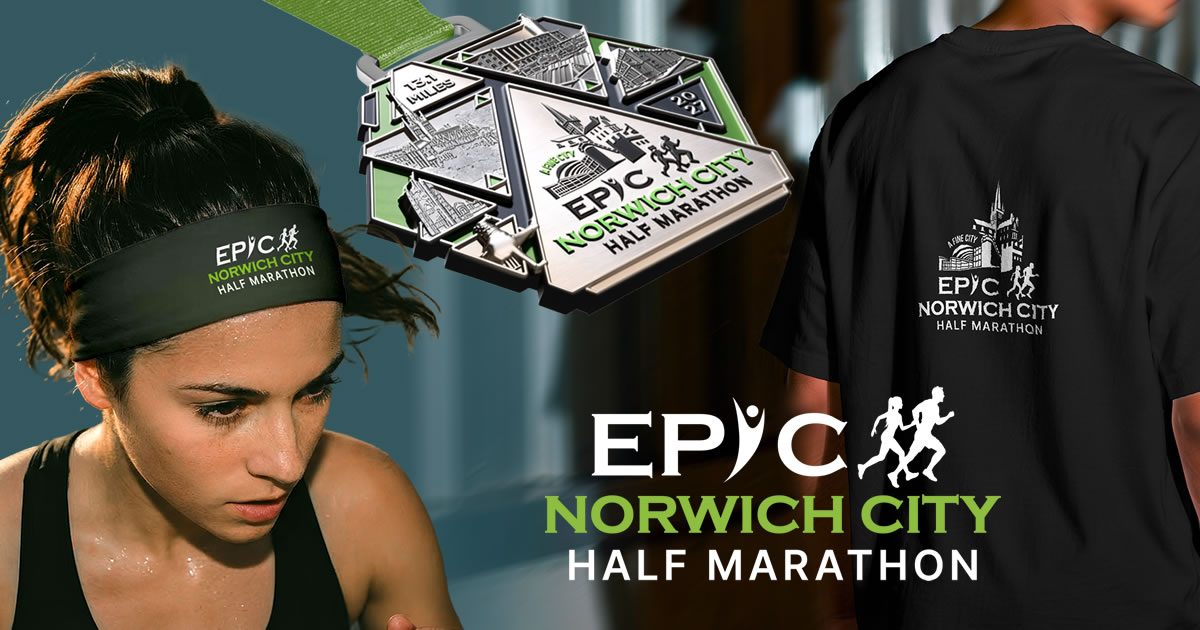
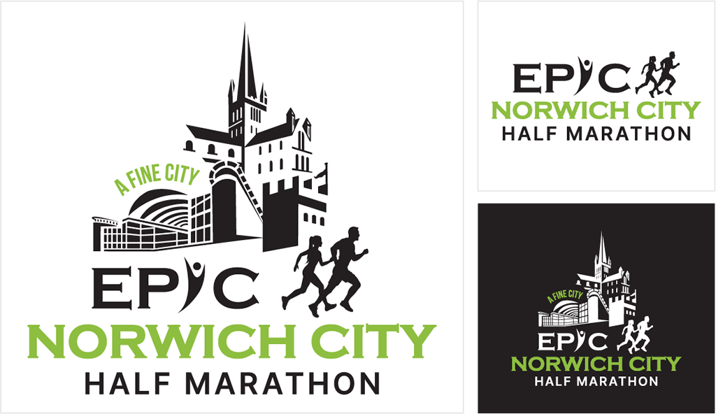
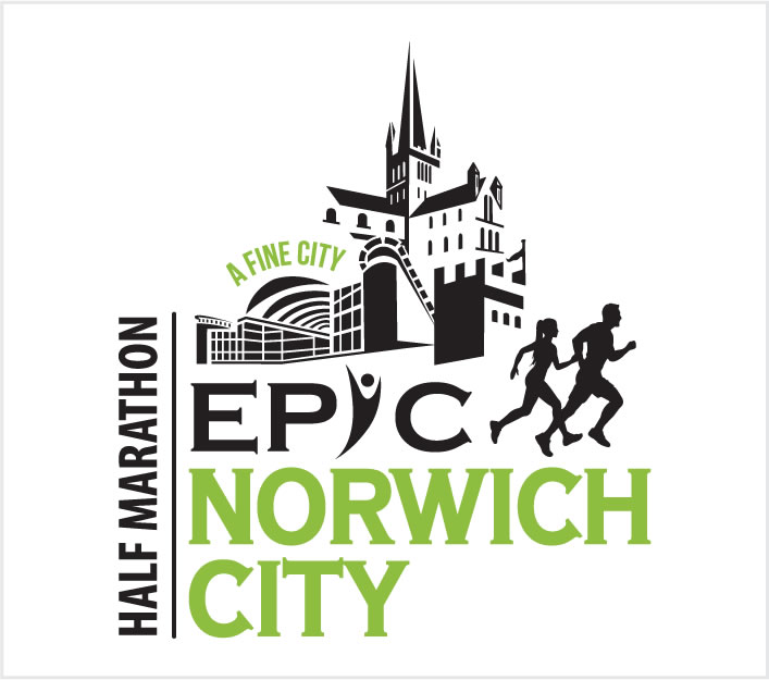
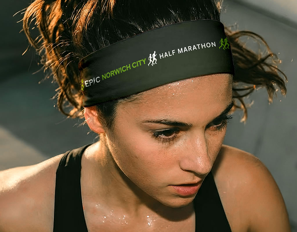
Following a name change, the newly branded EPIC Norwich City Half Marathon needed a refreshed identity that retained its existing recognition while strengthening the connection with EPIC.
The client requested the addition of the existing EPIC logo as well as the name change. I explored several directions before refining the chosen concept for maximum impact across all touchpoints.
FINAL DIRECTION
EXPLORING THE OPTIONS
CONCEPT 2
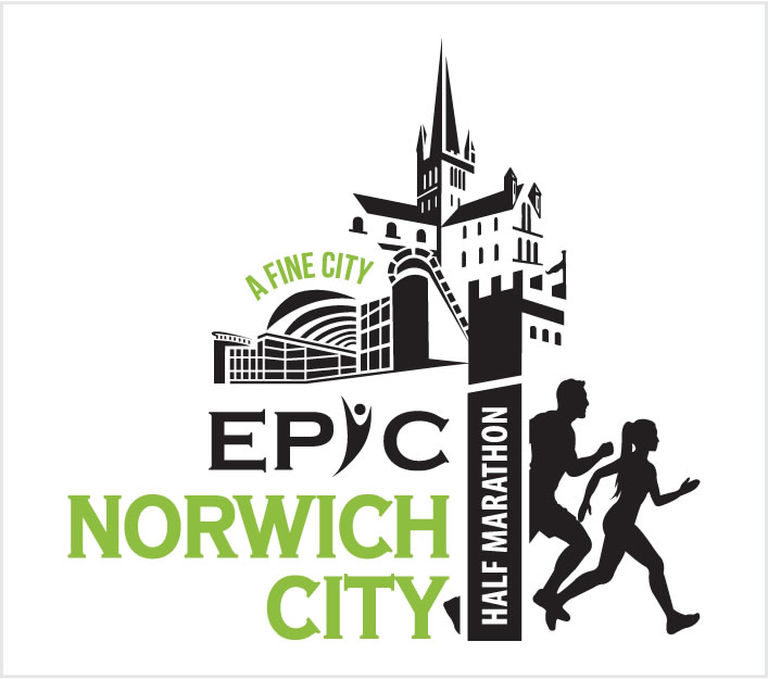
CONCEPT 3
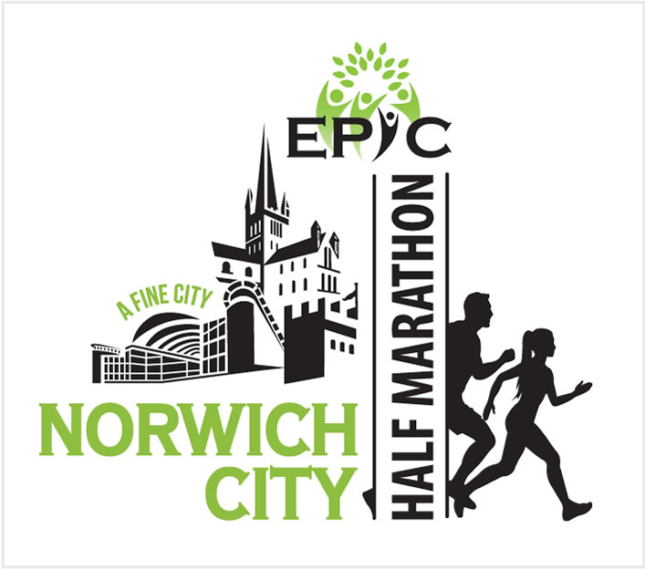
CONCEPT 4
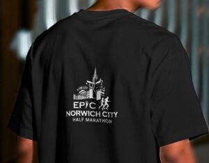
BRINGING THE BRAND TO LIFE
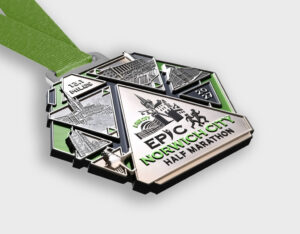
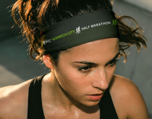
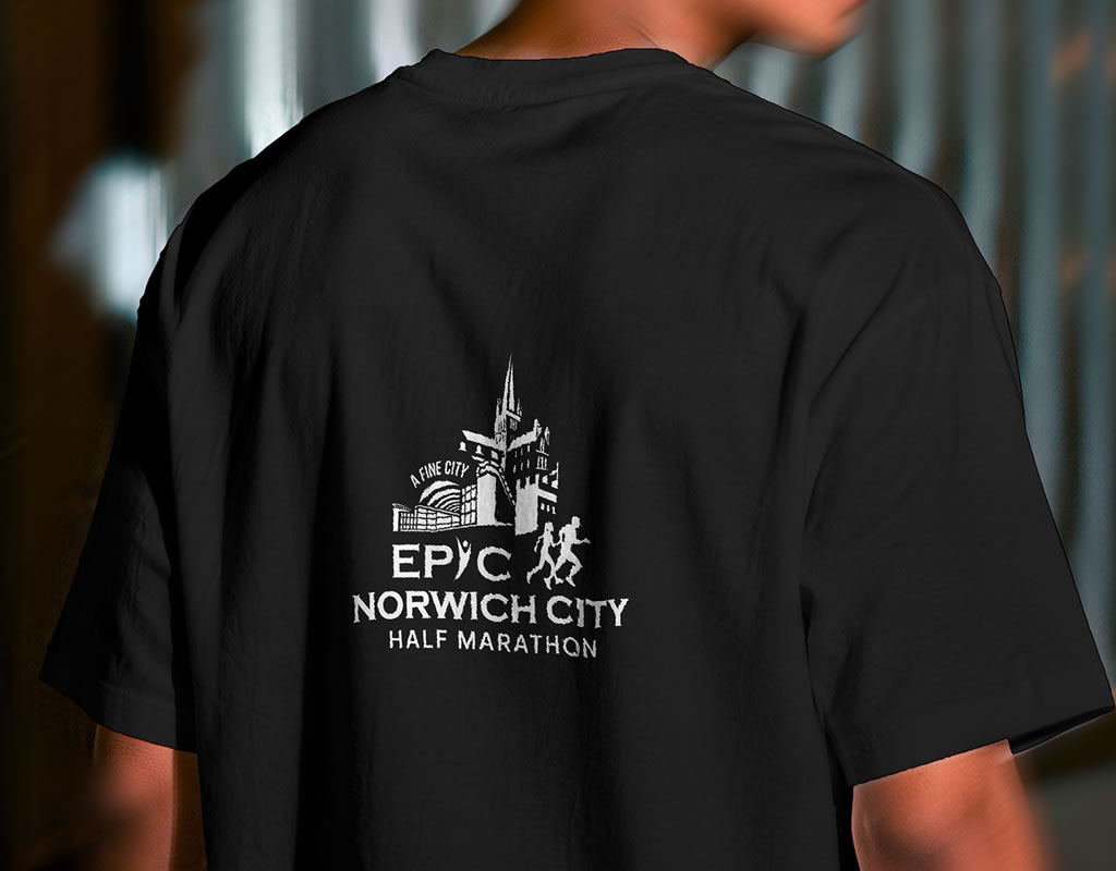
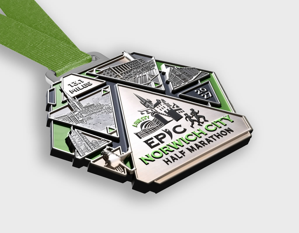
THE RESULT
The refreshed identity provides a strong, flexible brand system that works seamlessly across print, digital, merchandise and signage, helping create a cohesive, memorable experience for participants and supporters.
MAPPING THE ROUTE
Turning complexity into clarity
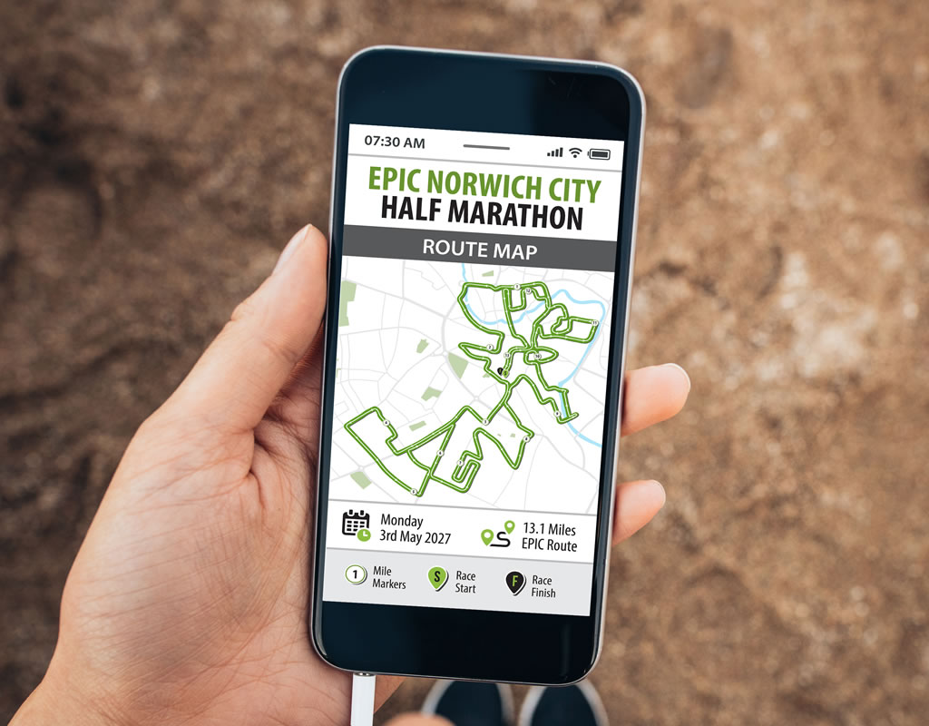
The route was supplied as a combination of individual section images and a full GPX file. These needed to be carefully pieced together, interpreted and simplified to create a clear, user-friendly representation of the complete course.
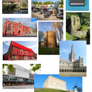
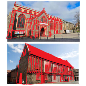
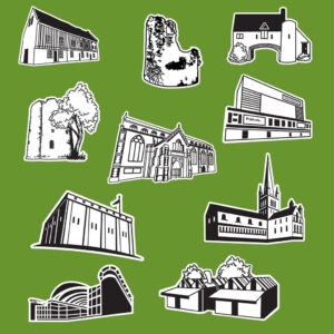
Once the route was finalised, I created a series of illustrated landmarks based on photographs, simplifying each one into black-and-white line artwork. These were positioned along the course to reflect where runners would encounter them, helping to make the map more engaging and easier to navigate. The event logo and a clear map key were then added to provide the essential information runners need, resulting in a fully branded, user-friendly route map that balances practical detail with visual appeal.
ROUTE MAP
TAKING THE BRAND INTO MOTION
To bring the campaign together, I created a promotional video combining branded motion graphics, event imagery and bespoke mockups. Selected template sequences were adapted to match the EPIC visual identity, with typography, colour and styling refined to create a consistent look throughout.
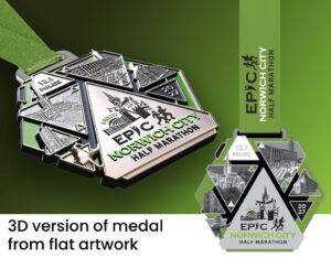
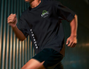
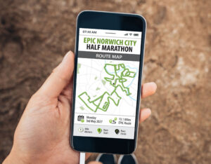
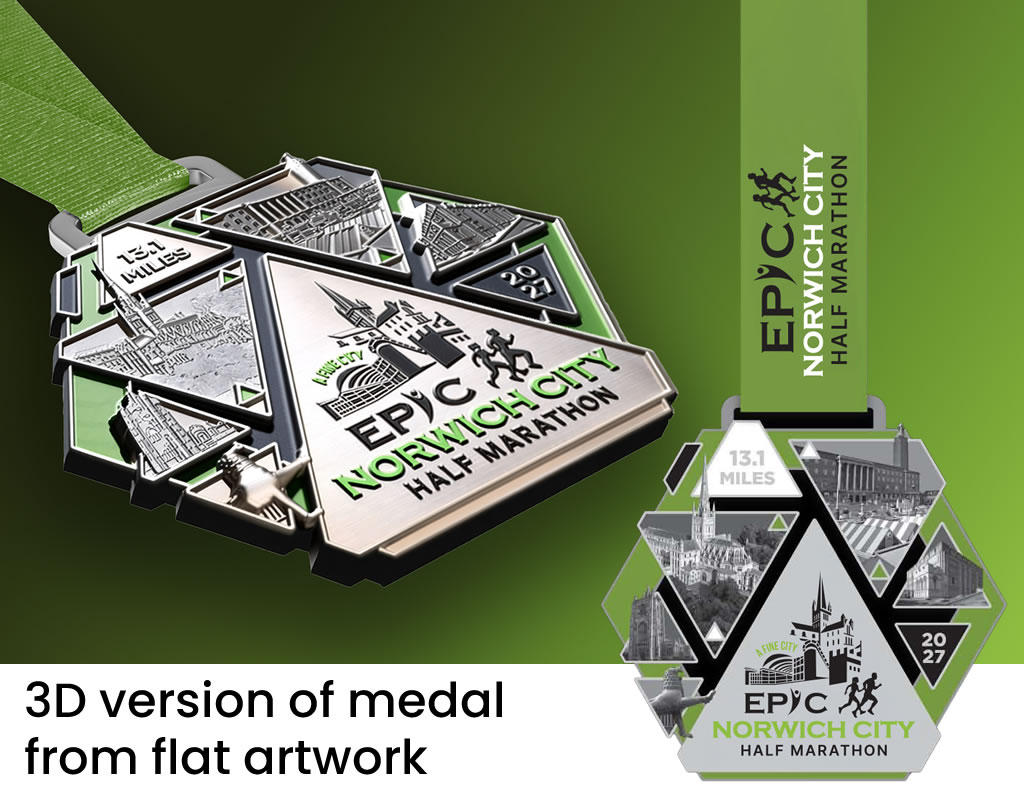
Additional visuals were created specifically for the video, including clothing mockups, a 3D representation of the event medal built from the supplied flat artwork, and the finished route map presented within a mobile phone mockup. These elements were animated and layered into the edit to add depth and showcase the wider event branding in context.
I also selected and edited the audio to suit the pace and feel of the video, helping the transitions and key visual moments flow more naturally.
Alongside the full-length promotional video, I also produced two shorter edits designed specifically for use in Facebook advertising.